


I know the month’s almost over, but I definitely have enough content to release two letters in a row, and isn’t that exciting?
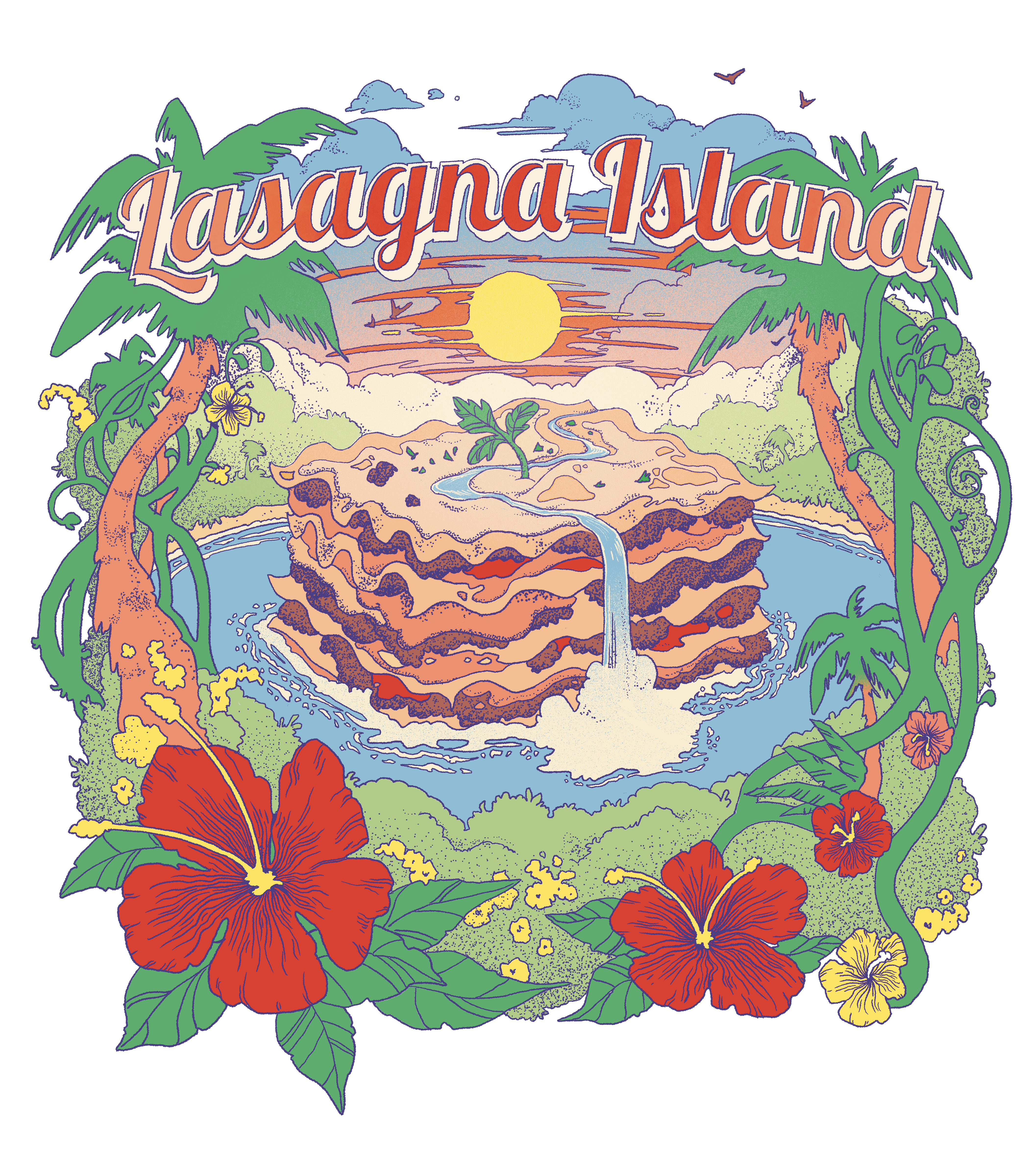
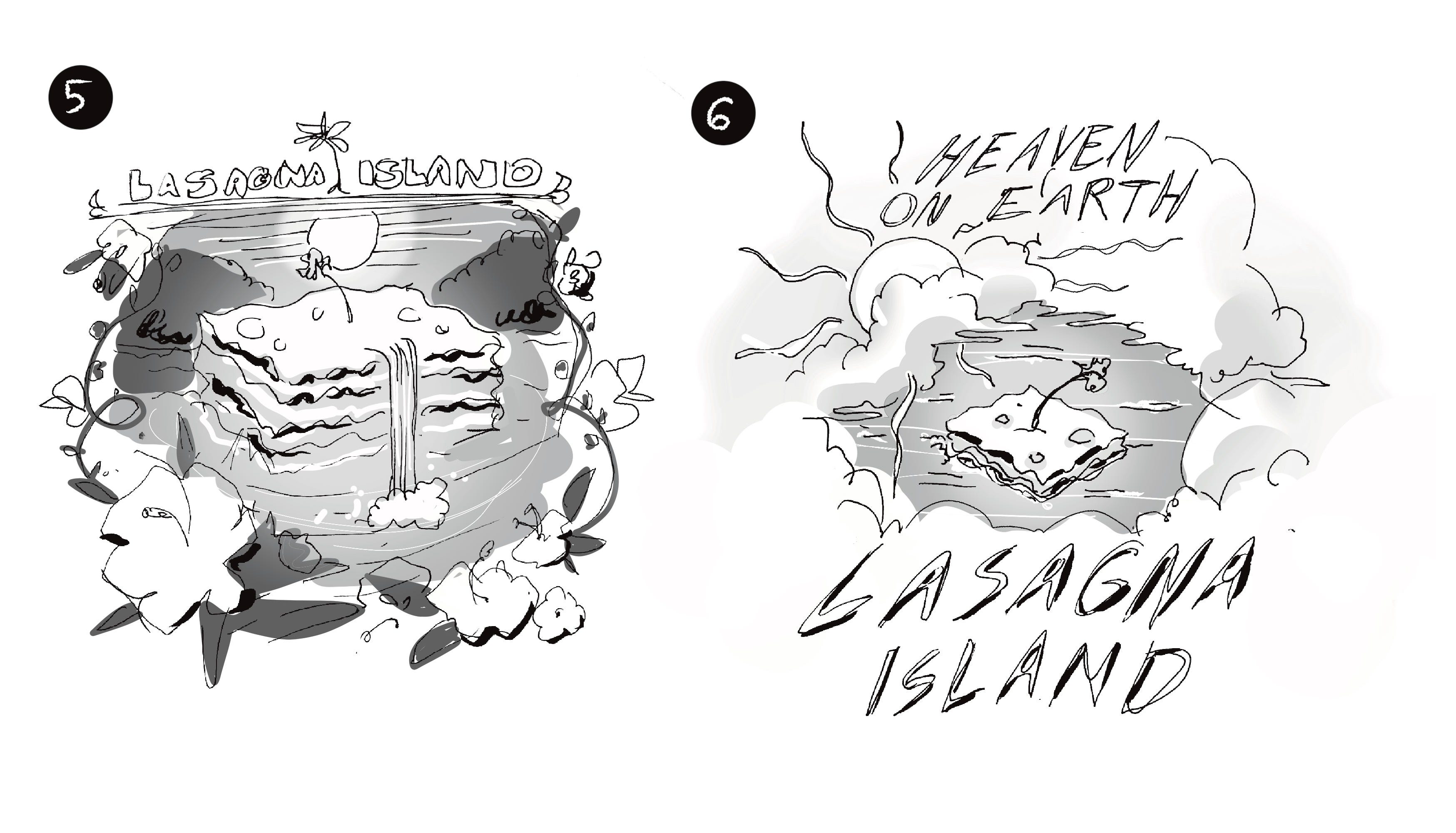
I’m going to spend this month’s letter highlighting some client work. First off is the second Lasagna Island shirt for the Try Guys! (you can see the first design in the March newsletter :))
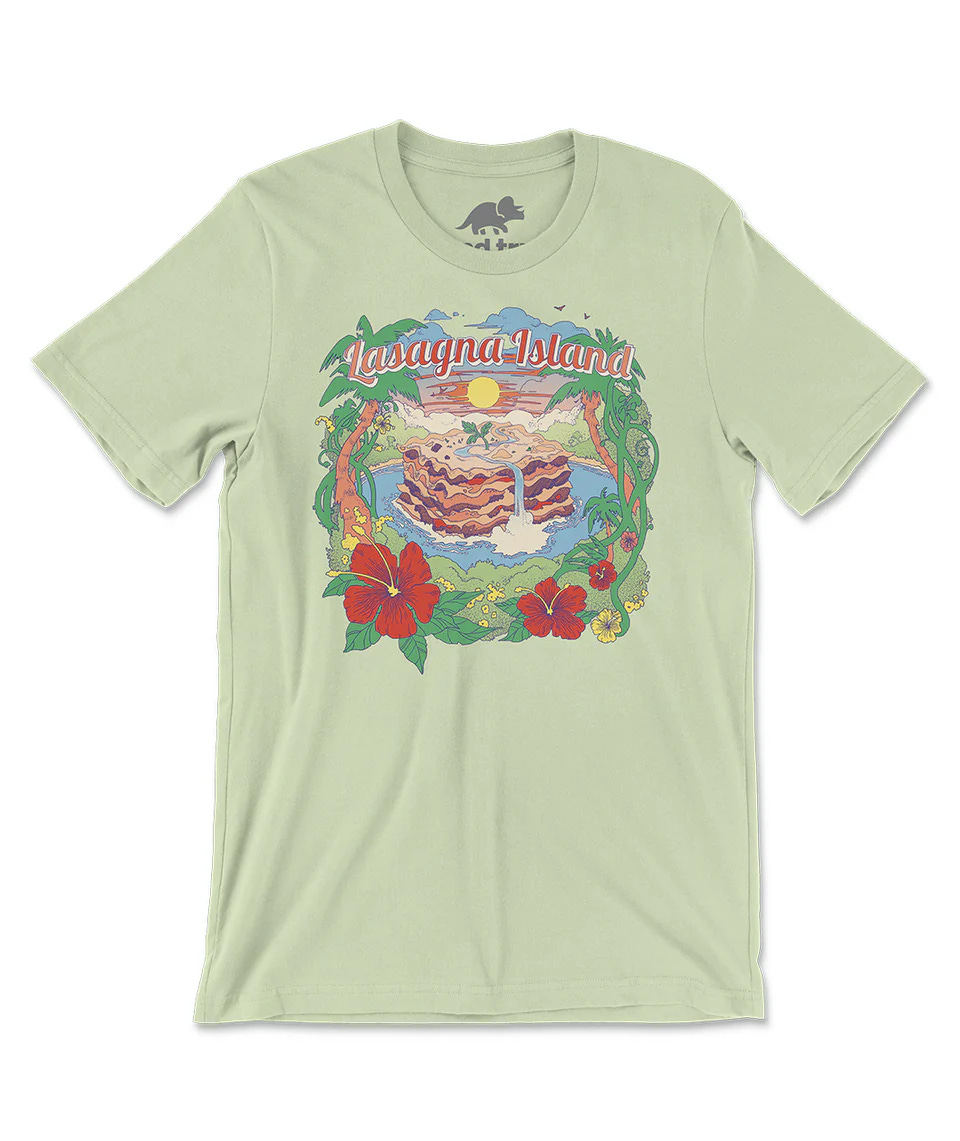
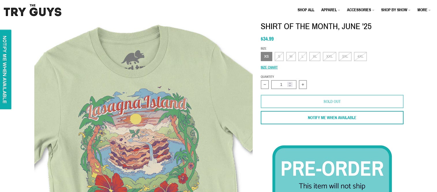
Sadly I was too late on both of these releases to actually promote them 😓. They’re limited edition and sell out pretty quickly. But I’m glad they seem to be in demand!
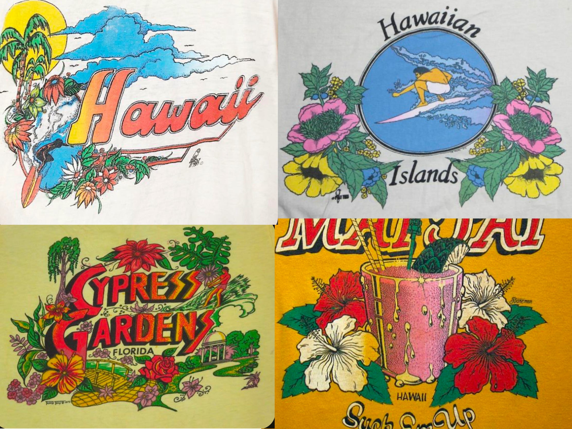
Since both shirts are out now I wanted to share all of the concept sketches I came up with. This brief was a really fun one of me. They wanted the designs to have a retro feel, and to straddle the line between “that’s so dumb” and “I would wear that.”
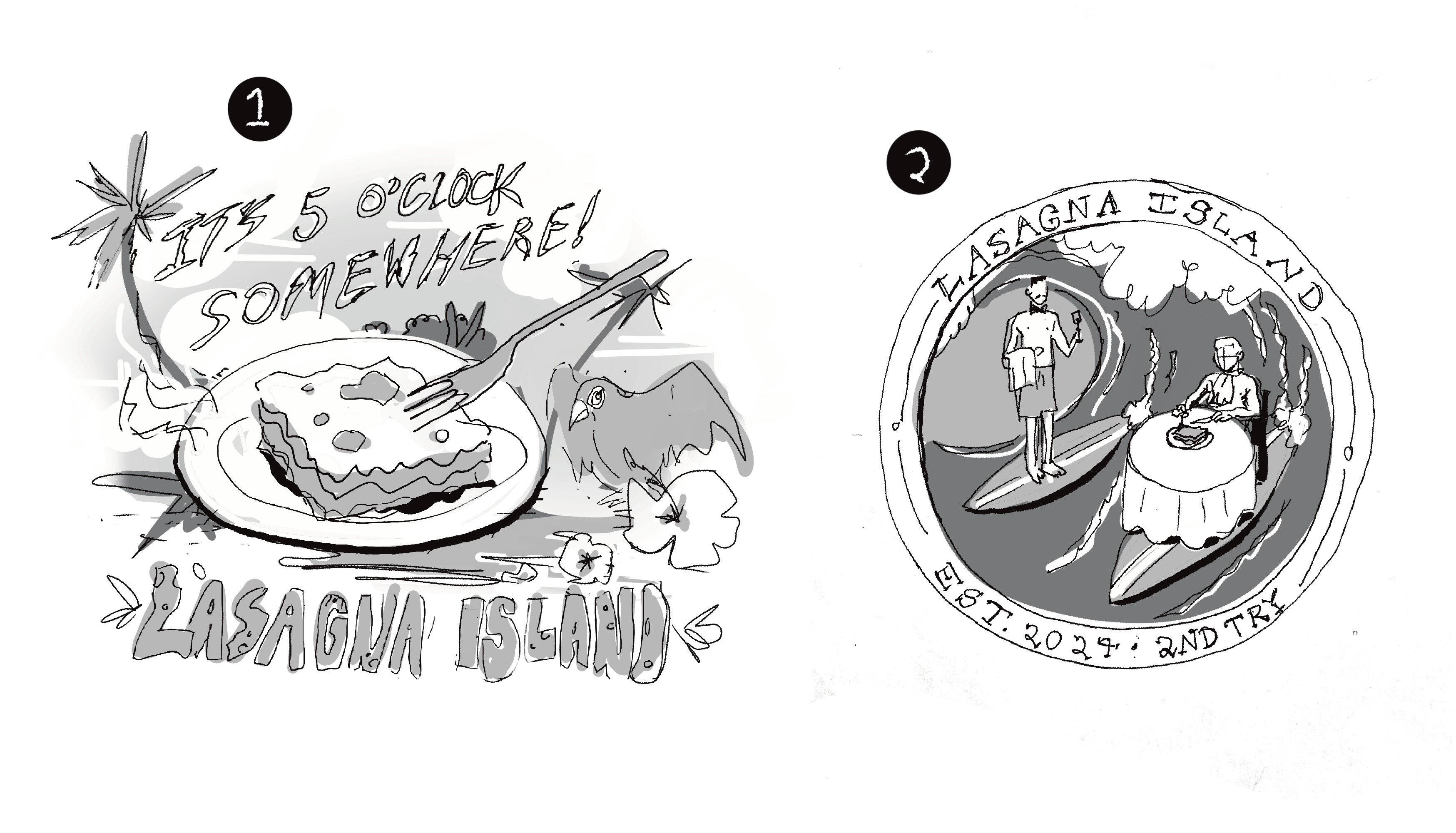
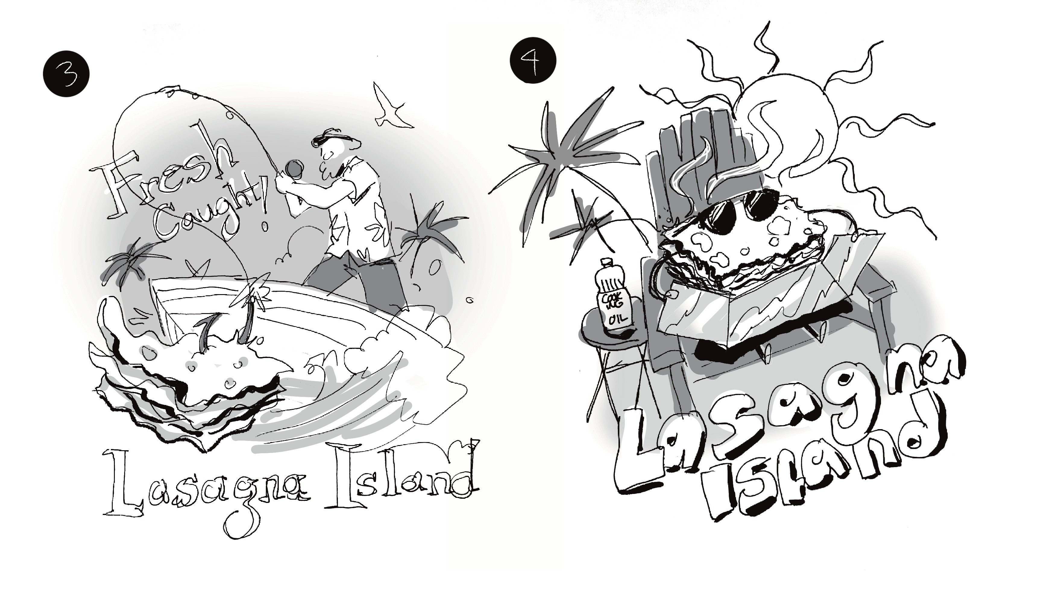
Here’s the sketch for this new design:
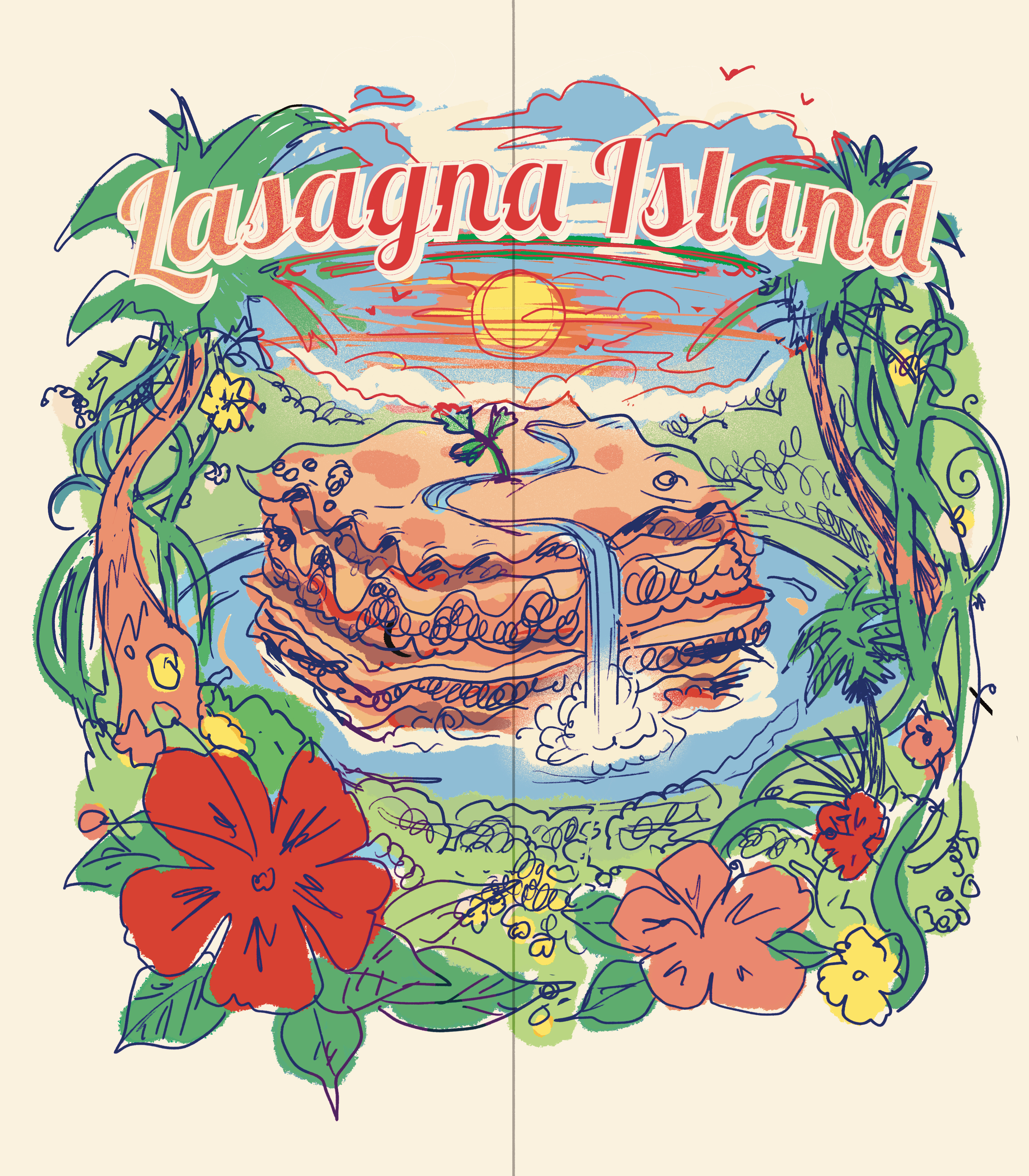
And the style references. This one also has a retro feel but is a little less silly than the other one, so I wanted some nice detail in there:
Stay up to date on Lasagna Island releases here!
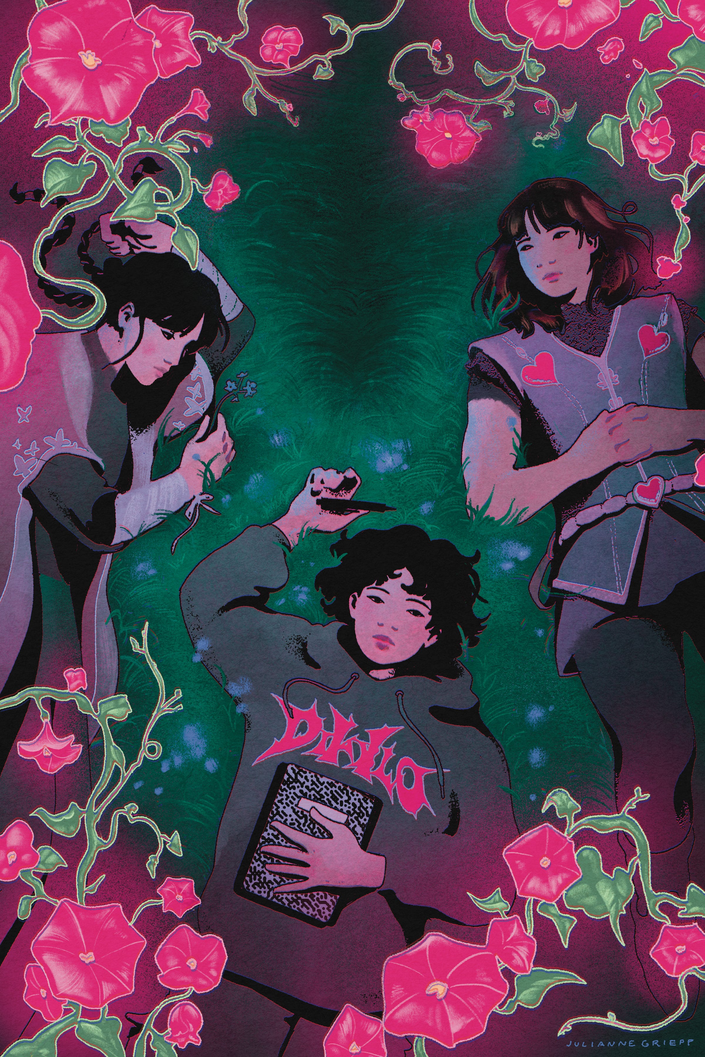
The second project from this month is a promo illustration for a soon-to-be-released novel by Lio Min, author of Beating Heart Baby. The book is called The L.O.V.E Club, and follows a group of teenage girls sucked into a fantasy video game made by their missing friend. Lio wanted a botanical-inspired piece, with a sense of unease below the surface.
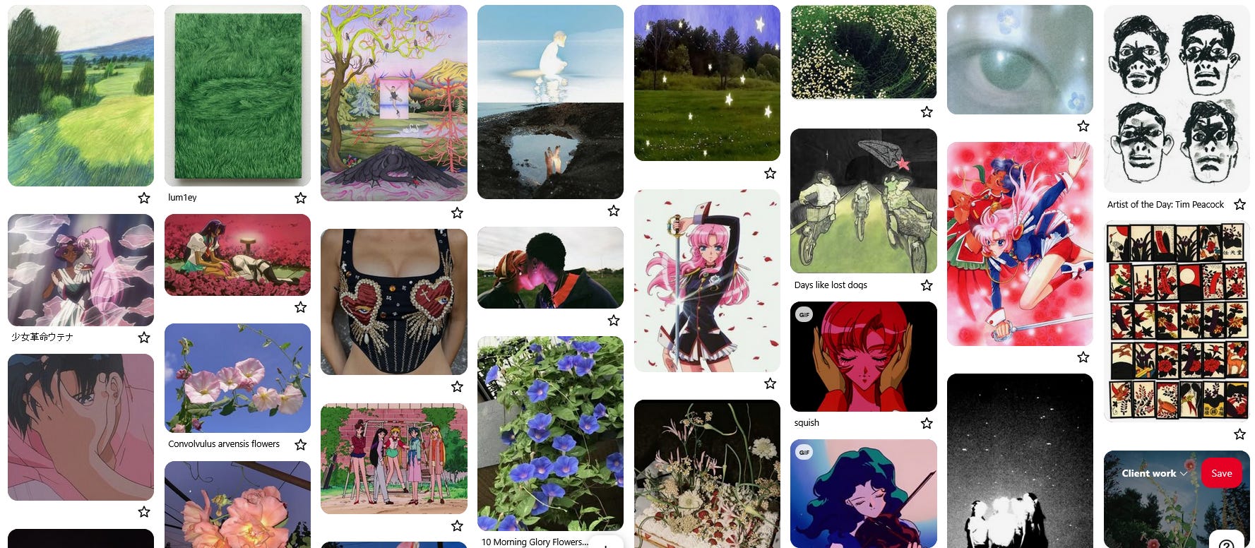
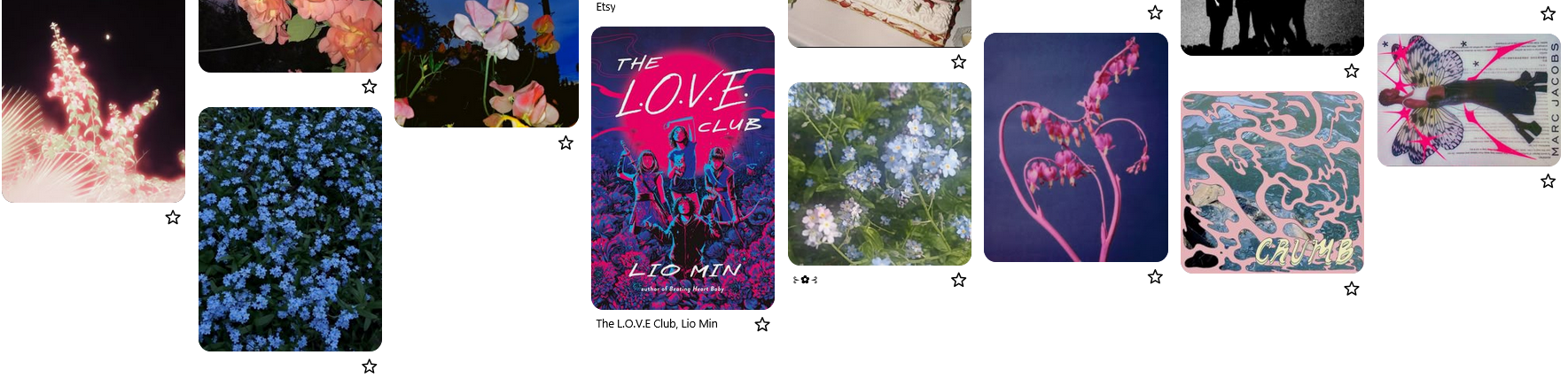
I wanted to share the moodboard for this one, because I feel like this was a very vibes-based piece, and the moodboard was super helpful in helping me capture the feeling I was going for.
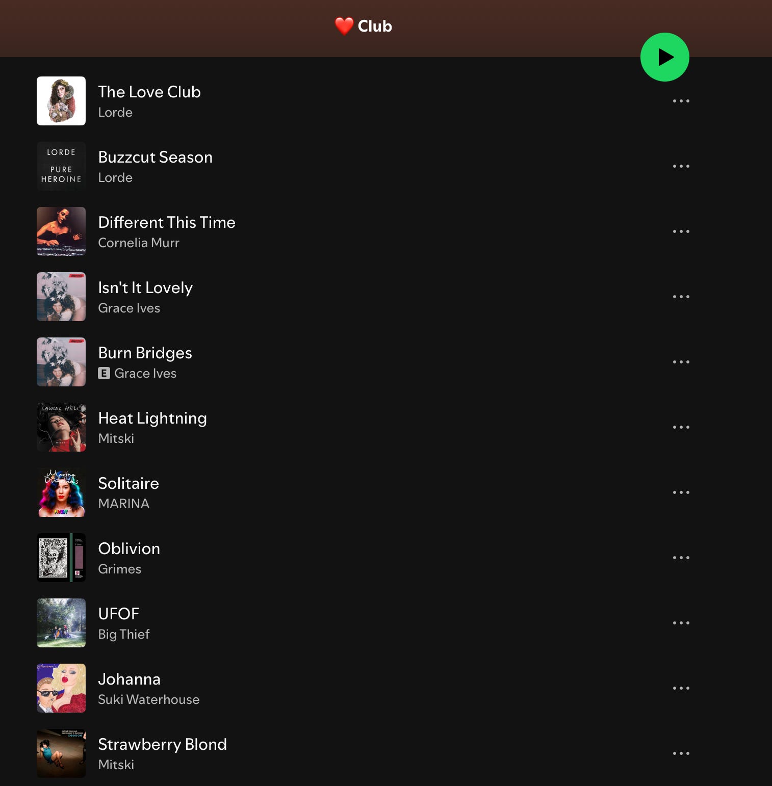
I also made a short playlist of songs to work to. I don’t do this for every project, but again, this one was very vibes-based.
Here are the concept sketches I sent; most of them focused on the missing girl, but the one we ended up going with focused on the other three girls, and their feelings of loss after Elle's disappearance.
And the sketch! I flip my digital drawings a lot while I’m working in order to get a fresh eye on things like proportion, gesture and composition. At some point I lost track of the original direction which is why the sweatshirt logo is backwards 😅
You can pre-order the book here!
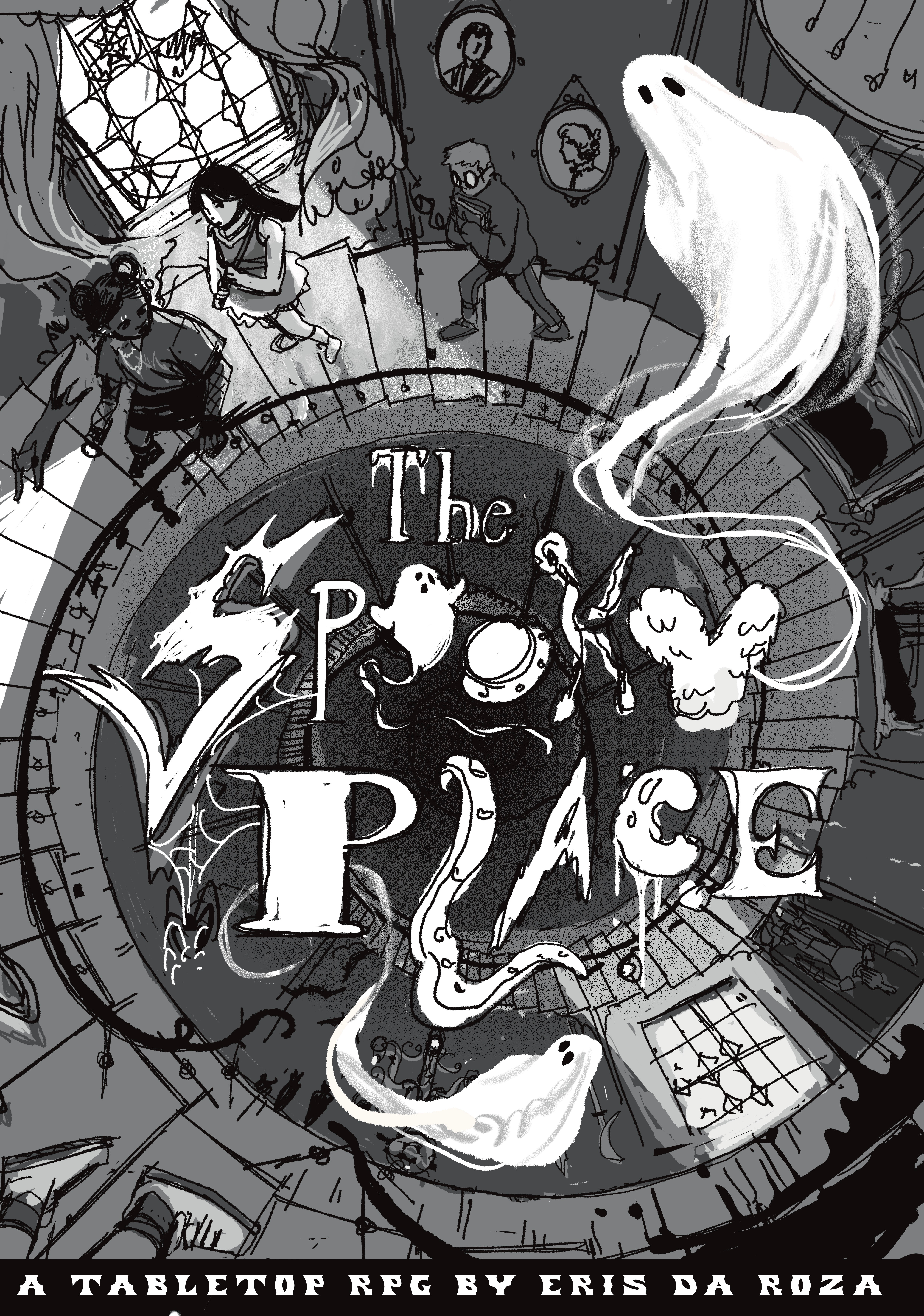
Next is a cover for a downloadable tabletop RPG: The Spooky Place by Eris da Roza. Eris described it to me as a game about a haunted location, some dumb kids, and lots of classic horror tropes. I wanted to do a very classic Scooby-Doo type haunted house scene, with fun lettering representing all the different genres/tropes that the players are encouraged to explore.
Here are the concept sketches. The first one was Eris’s idea, but I wanted to give a few options just in case, and Eris ended up liking the last one.
Here’s the sketch! The main thing here was getting the crazy perspective look natural. It took forever but I think it was worth it.
One more client project. This one was more graphic design based, which I don’t do a lot of but always have fun with. Jiji, a NorCal-based dog groomer, wanted a logo for her business cards.
Here’s the inspo she sent me:


The designs I came up with:
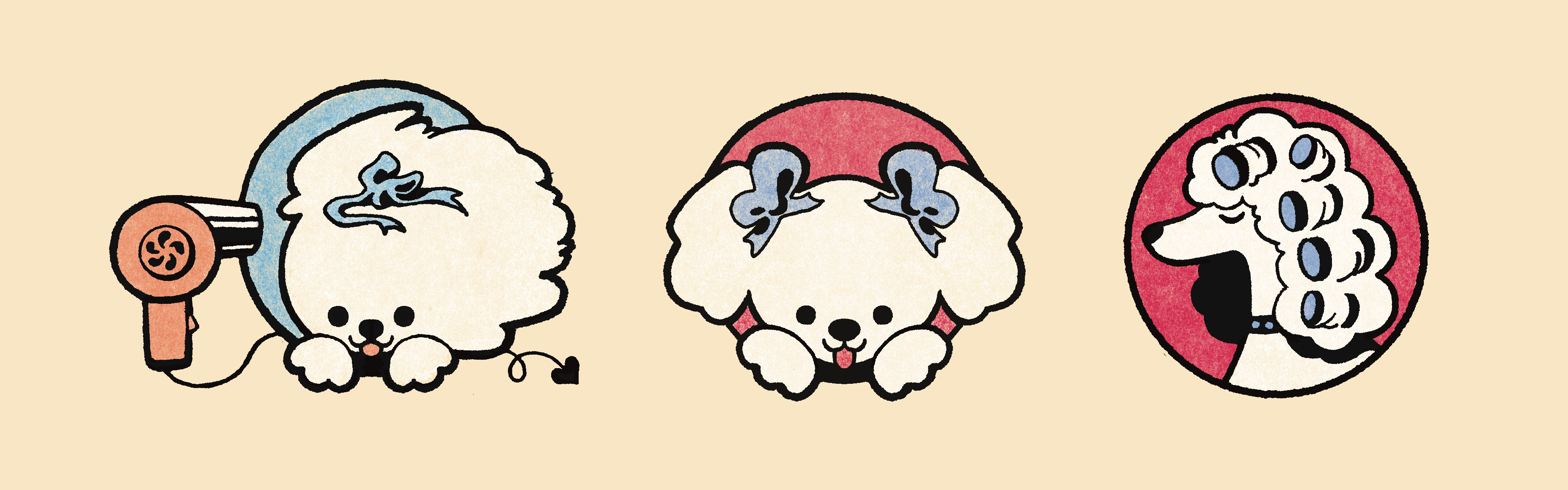
And the final logo!
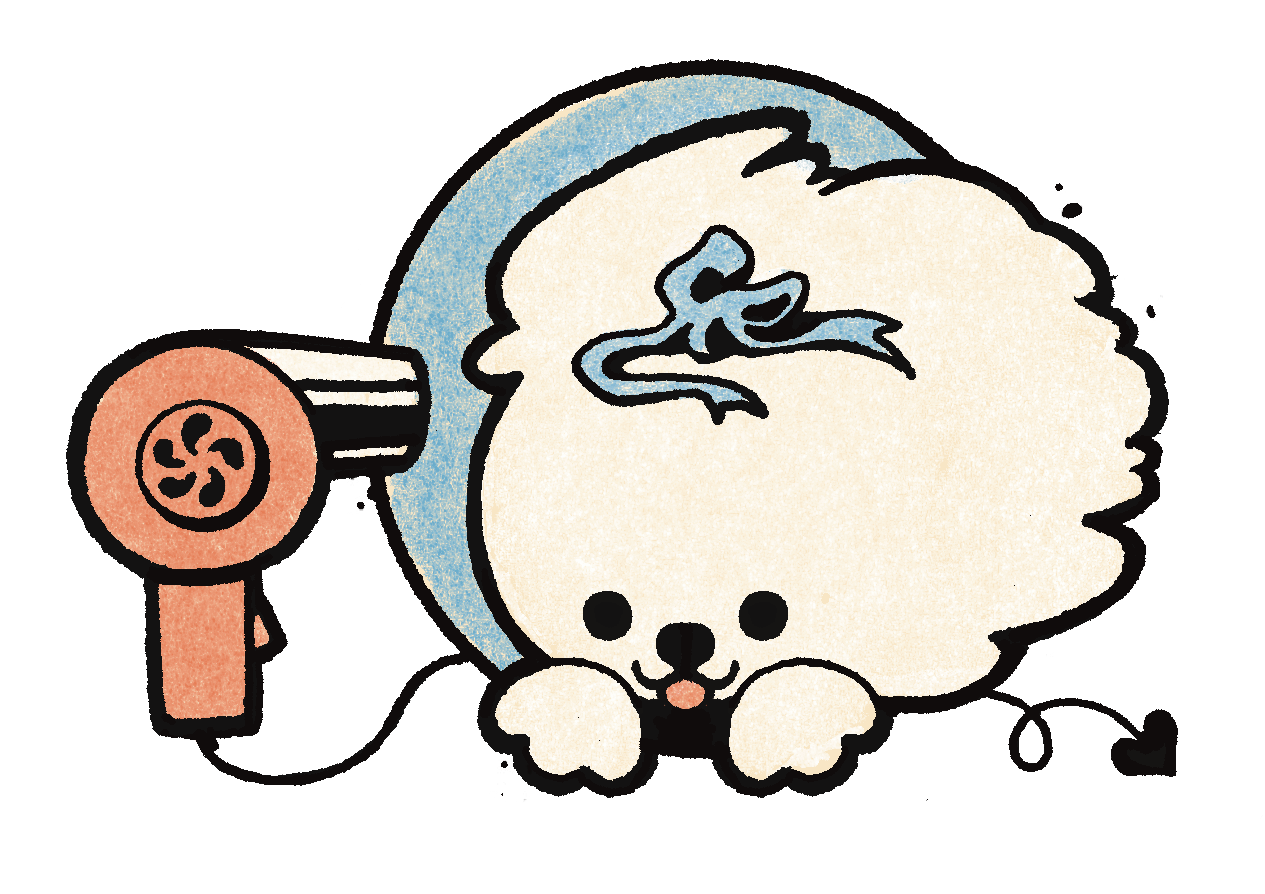
So cuuute 🥰
I love how different all of these client projects were. One of my favorite things about freelance is that I get to work in so many styles, with a really wide variety of themes and outputs. I have so much reverence for all kinds of art, and I get antsy working in the same style for too long. I love to study and experiment and discover new techniques, and I’m really grateful that freelance gives me the opportunity to do so 🥰
Thanks for sticking around! Have a great.. couple of days? until my next letter ;)

It’s exciting to read about your work.
So happy to be included on your email list. Susan